Commenting on classmates discussions on the programs they have selected
In your responses to your peers, share your thoughts on the features they used in their programs and explain what you learned from the post.
Classmate # 1 Ridge
With this discussion i chose to make a double exposure type of image using one of my personal heroes and one of my favorite quotes. I used photoshop for the entire picture. I began with a picture of MLK and adjusted the channel to the one that made more contrast. Once i chose the channel i filled in the rest of the highlights with black to create a silhouette. I then found a background that i wanted to enter into the picture. i fit the background into the silhouette in a place that i liked then changed the layer to multiply. using the eraser tool I faded the foreground into the background. I placed the American Flag behind the silhouette. Then typed the quote and added a 3d effect to it. I want to get much better at photoshop. I am slowly getting the hang of illustrator and hope to get better at that program.
Classmate # 2 Jay
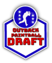
I was talking with an organizer at a local paintball field where I play and I offered to make a logo for an upcoming event they are thinking of hosting. I offered to make it for free since I am still learning, but i’m very happy with the way it came out and so was the organizer of the event. I used Adobe Illustrator to make the logo. I started by using the pen tool to trace an image I found on Google of a guy playing paintball. Then i created another layer of a hexagon shape and replicated it with another layer on top of that so that it would have a boarder. I used colors to fill in the hex and circle shapes and placed the traced image of the player in the middle of the circle. I added typography and an arch affect to the words so that they would appear to be raised a bit. I also achieved the raised affect by adding a drop shadow to the words and the circle as well as the hex shape. I used some gradients and different textures at first but did not like the way they came out so i eventually replaced them with solid colors. I took inspiration from the NFL logo and thought it was appropriate since the event organizer wanted a “draft” style event. I began playing around with the ‘3D’ tool to see if I could manipulate the whole graphic to put it off center or make it appear more appealing but it did not always look right and it took a very long time to render. I am happy with the way this logo came out and am excited to create more.
Classmates discussion pictures are provided
just view there discussion and photos and comment
Solution Preview
Commenting on the Selected Programs
Response to Classmate 1: Ridge
Ridge decided to design an image. He created it using one of her best heroes. He also added one of his favorite quotes.First and foremost, layers are essential when designing Photoshop (Lambert, 2016). Ridge knows how to work with layers.
(340 words)


